
Overview
Our team was worked with Together Chicago through the Multidisciplinary Design Program. Chi77 is a dynamic asset mapping tool for use by nonprofit organizations to help them become strategic and data-driven in their outreach, in order to maximize their impact.
Worked in a team of six. I led the UX team consisting of two other designers / researchers.
Design: High-fidelity interactive prototype
Motivation
There are challenges in implementing data-driven approaches in non-profits and in community development. When done improperly, it can negatively impact organizations, leading to data drift and disempowerment, or at best be useless to them. Applications made for organizations must keep users at the forefront to make it truly useful for them.
The goal for the Chi77 platform is to consolidate relevant data about the Chicago area in an web-based tool, where it can be easily used by Together Chicago's stakeholders. The tool should allow users to easily search and compile data on a specific geographic area. This will allow stakeholders to better target areas of need, and improve strategies for providing social services to make the greatest impact.
Challenge
How can we enable Together Chicago's stakeholders to gain a holistic understanding of problems, explore new ways of thinking, and make informed decisions that maximize their impact?
Solution
Our team prototyped the Chi77 application, a web-based asset mapping tool for data exploration.
Research
We spoke extensively with our client, Together Chicago, who shared valuable information about their stakeholders who would be the primary users of Chi77. These stakeholders are strategic, data-driven decision-makers amongst Chicago-based organizations that provide social services.
- They lead initiatives to reduce violence, revitalize neighborhoods, rebuild ghost lands, create jobs, create homeownership programs, and more.
- They need a way to visualize geographic data so that they can better understand their users and make informed decisions.
- These users aim to foster ecosystems of collaboration and development to holistically address socioeconomic issues in Chicago.
Together Chicago's key partners include organizations who work in the healthcare, education, and crime spaces. Knowing this, our team focused on working with these three groups of data.
UX Approach
To scope our work based on our client's priorities and a strict project timeline, I worked with the UX team to define our approach going into the design process:
1. Reassessing the previous team's design decisions. Working through existing UI designs with a new perspective after redefining our project goals.
2. Understanding our stakeholders and users. Stakeholders include non-technical users, which was an important consideration in our design process.
3. Focus on good data visualization. The biggest design challenge that our team faced was the data visualization aspect. The map acts as a centralized platform between datasets, and we focused on visualization of "data overlays" in our brainstorming sessions.
Early concepts
Each designer individually worked on low-fidelity concept explorations. My designs can be found below:

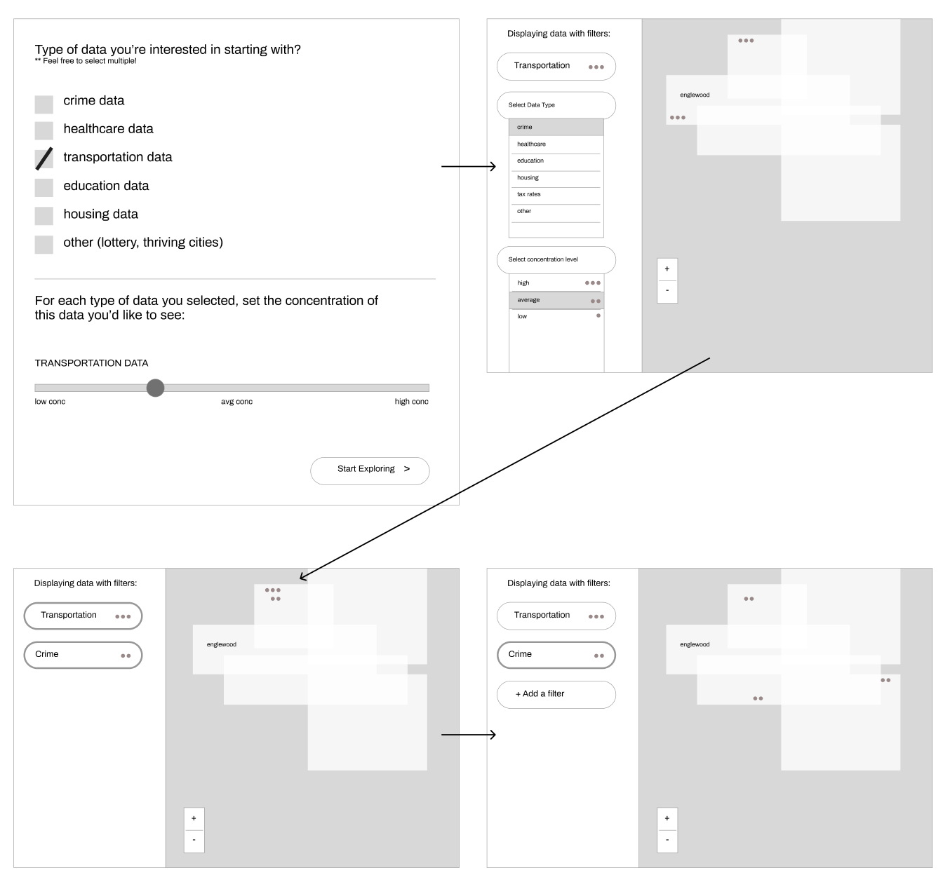
To avoid information overload and accommodate for non-technical stakeholders, the goal behind these concepts was to start navigation broadly and narrow down specifics throughout the journey. As users add more filter dimensions and pinpoint specific geographic areas, they would see information tailored to their filter and search criteria.
Mid-fidelity iterations
We consolidated our user flows and refined our early concepts into a mid-fidelity interactive prototype, in preparation for in-person usability testing sessions with our stakeholders.
User testing
Usability Testing
After creating a usability test protocol and consent forms for our participants, we conducted 4 in-person usability testing sessions with our key stakeholders, using our mid-fidelity prototype.
Results:
• Users wanted to see more information in a single-pane view, rather than having to navigate to multiple screens
• Users were more technically inclined than we had anticipated, so having a onboarding flow was extraneous.
Heuristic Evaluation
We also conducted a heuristic evaluation using Nielsen's 10 Heuristics for UI Design to objectively measure that we are meeting industry standards.
Results:
• Chi77 platform did not pass 100% of heuristic tests
• Notably, there was one or more violations with a high severity level.
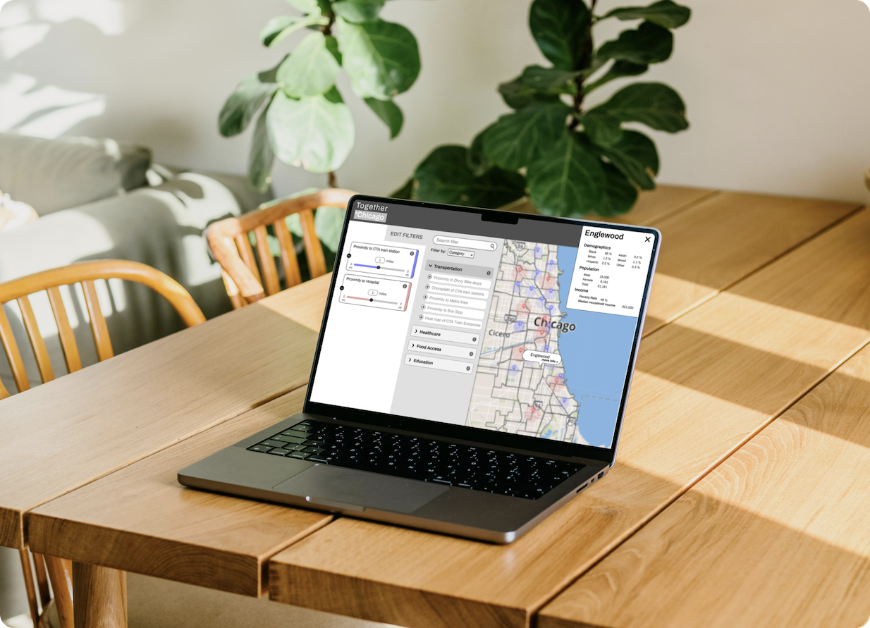
Final Design
We incorporated the feedback from our usability testing sessions. Our final designs also passed a heuristic evaluation for usability of the tool.


Impact
We successfully delivered a high-fidelity interactive prototype of the Chi77 application, along with a UX specification documenting our design rationale, past issues and future design considerations, to our client.
* Our client did not share how our work landed with their organization.
Next Steps: Adding nice-to-have features requested by our stakeholders, such as better search functionality, additional filters, color-coded filtering, and designing for accessibility.
Takeaways
- Having the opportunity to sit down with stakeholders in person and listen to their feedback is invaluable. We were able to make substantial progress on our project by collaborating and making decisions in real-time, which allowed us to quickly resolve blockers.
- Designs should be adaptable based on technical feasibility, and having strong alignment with Engineering counterparts throughout the process is crucial.